My Role: UX generalist | Duration: 4 days | Project Status: ended
Project Overview
I took part in a UXUI hackathon over the course of 4 days with three other designers. The following is the prompt we were given.
For this special 4-day hackathon, your team will select a social cause (i.e. climate change,
Black Lives Matter, homelessness) or nonprofit organization (i.e. Greenpeace, United Way,
Peace Corps) that they care about and design a mobile or desktop experience that addresses an aspect of this issue. Your solution should not try to solve world peace in a mobile app. Rather, your solution should support a realistic aspect of this issue or cause that can be addressed using technology.
Your team will have 3 days to identify a social problem and design a solution.
We do not expect you to use every tool in your UX toolkit. Rather, this is an opportunity for you to move quickly, to take creative risks, and identify the most essential steps that will help you arrive at a realistic and compelling solution.
For our topic, we chose Food Insecurity, seeing that it is a problem that people face all around the world.
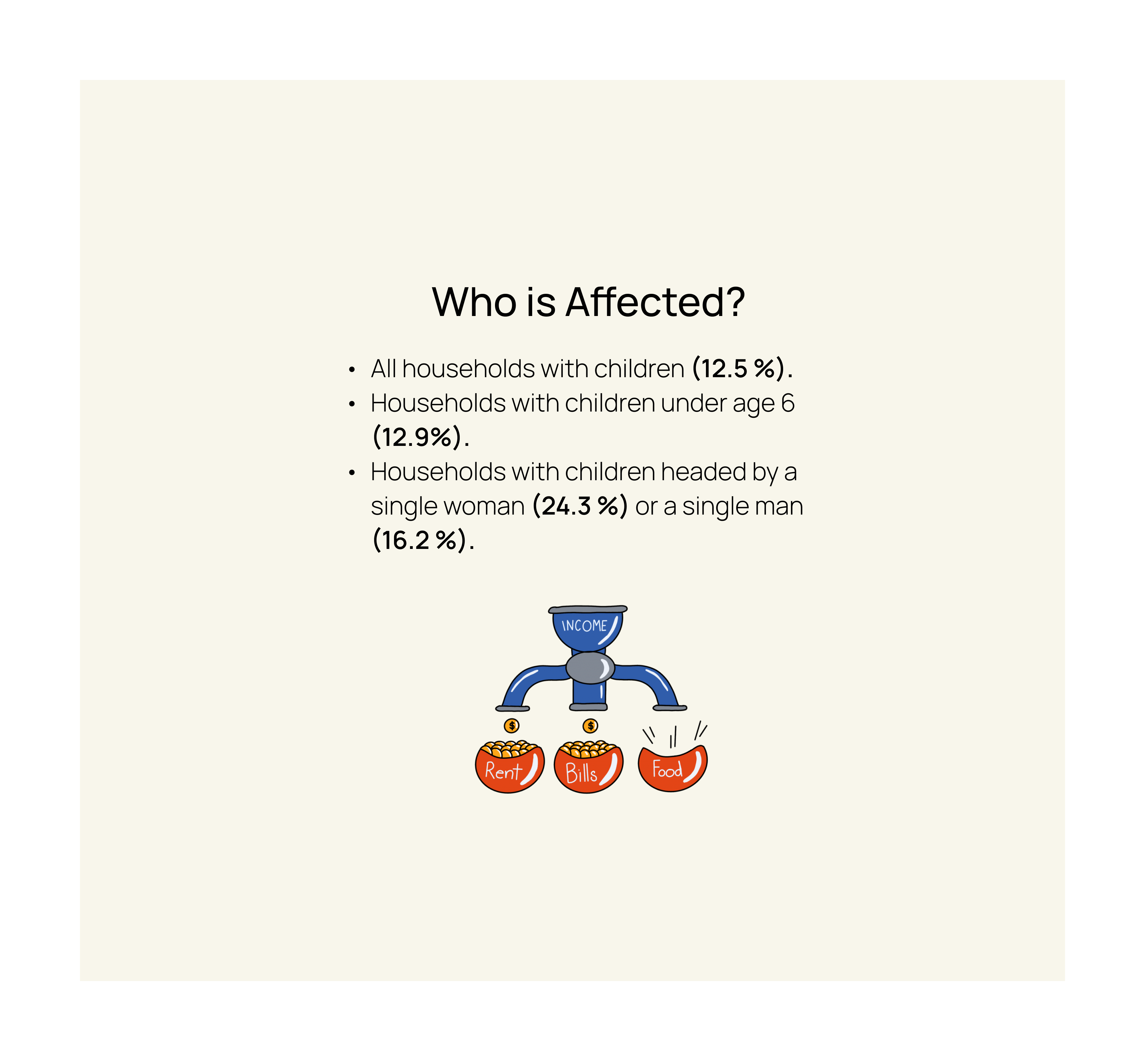

Discover

15
Surveys
8
Interviews
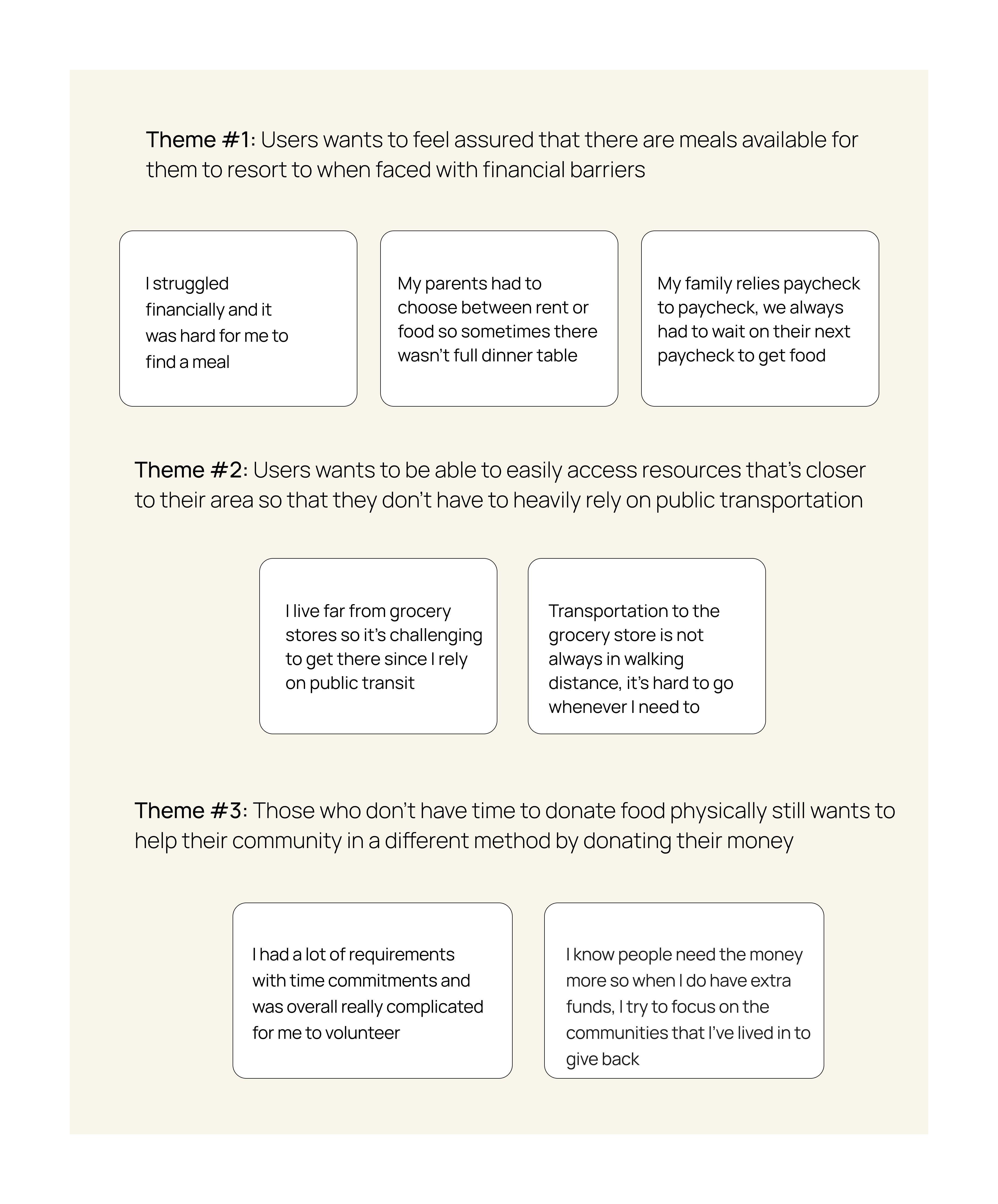
Themes
Competitors and Comparators

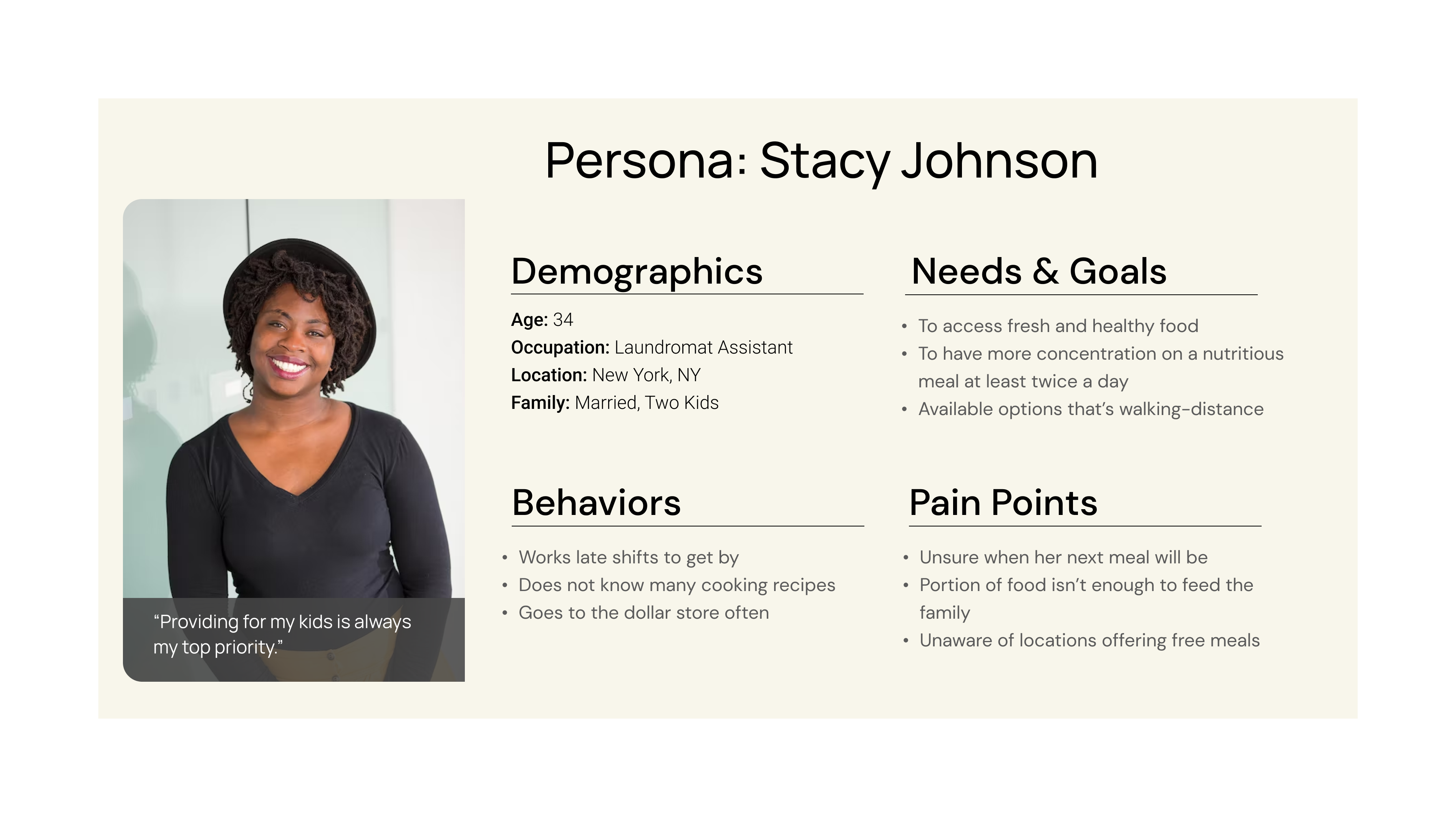
Personas

Problem Statement & How Might We
Stacy needs a resourceful way to access healthy and nutritious food due to the limited socioeconomic barriers.

Design
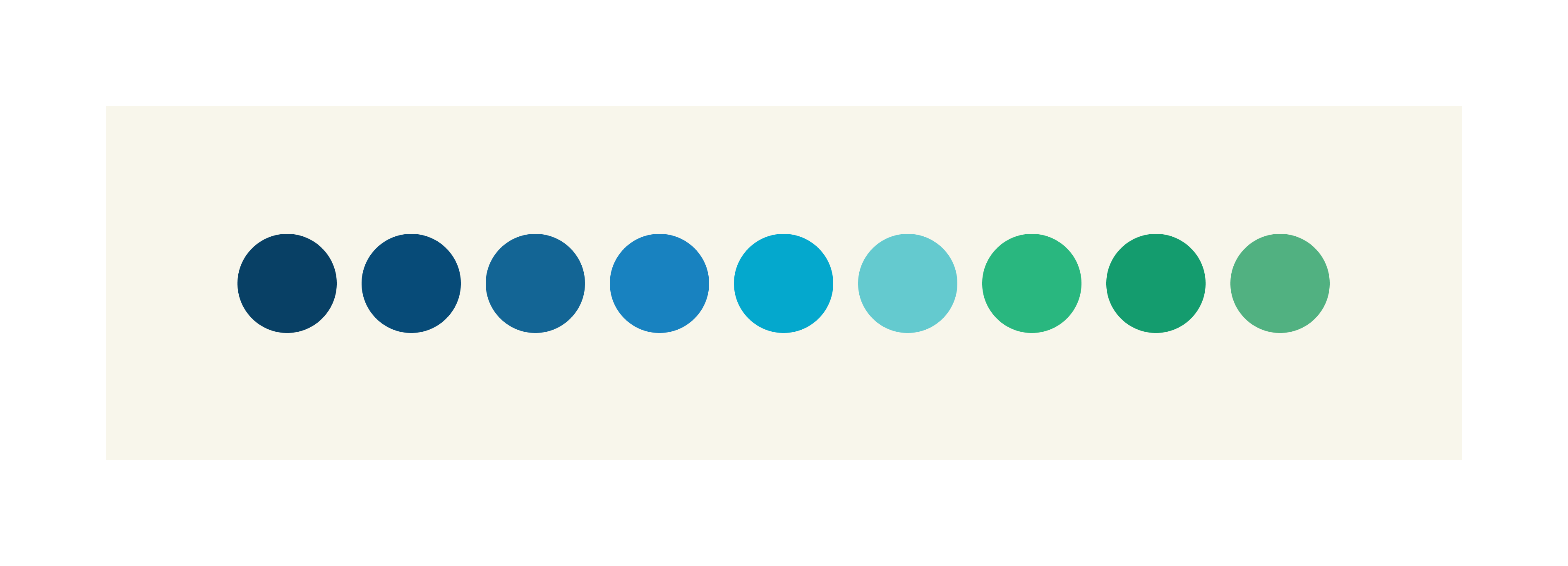
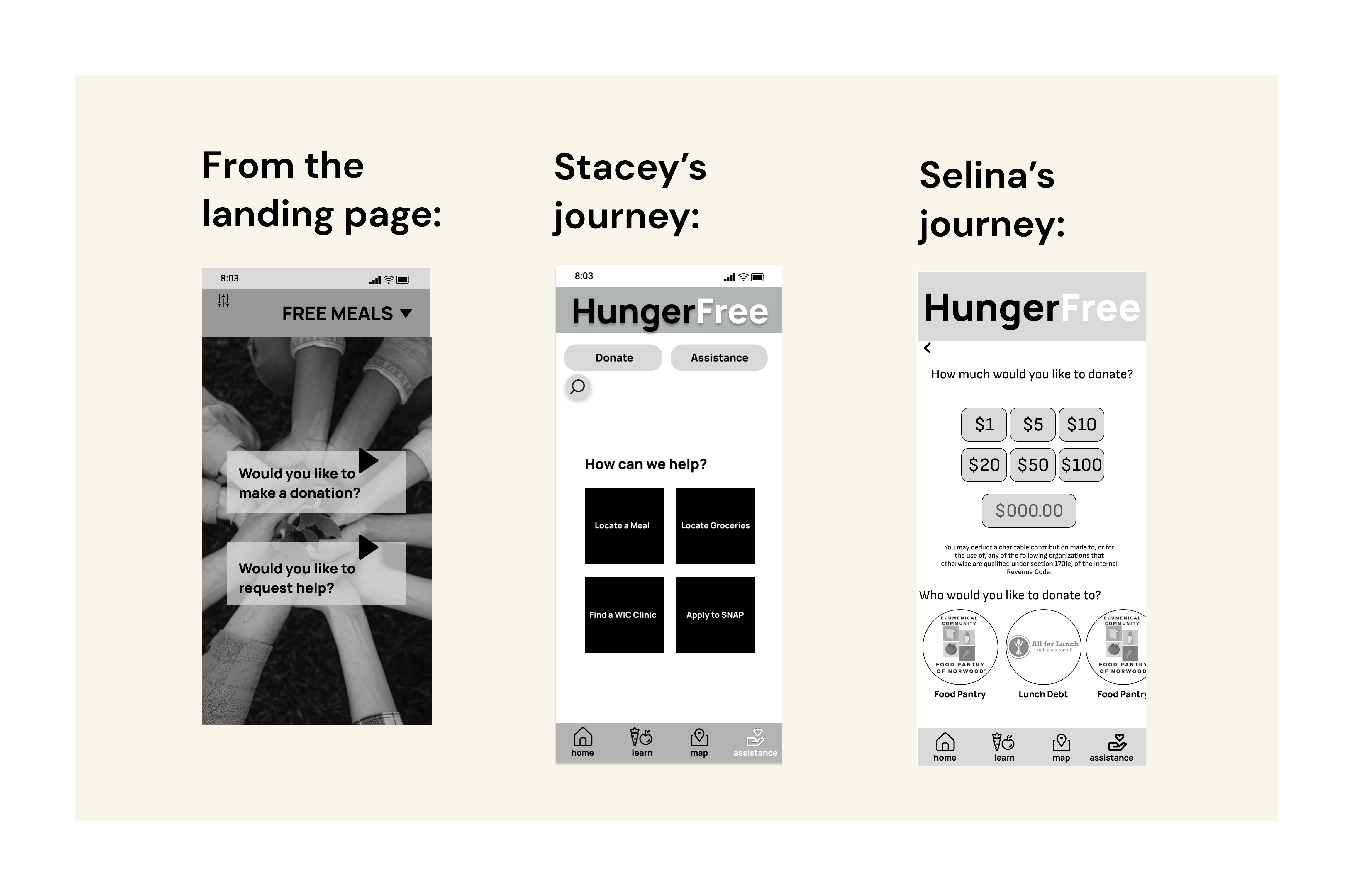
If people using the app are already strugguling with food insecurity we shouldn’t increase their appetite by using warm tones.
Studies suggest cool tones increase empathy; donations
To make our app accsessible we choose to add titles to our icons, both for redundency and so there was less to interpret.
Based on our research we found that warm tones increase a user's appetite. That's why most restaurants use colors like red. We decided that if a user was already struggling with food we should choose cooler tones, and on the other side of that, cooler tones have shown to make people feel more empathetic, so it could potentially increase donations from our advocates.
Next Steps
- We will review our icon choices with A&B testing
- We will create an encrypted texting capability within our app
- Expand our app to target more communities that may be in need of assistance
Selected Works

Peer Solutions WebsiteCoporate design

Lady Powers performed by Princess ProzacDrag Video

Reflection perfromed by Dirtee XDrag Video

Florsit commercialProject type

BlackFacts.comClient Project

An Ode to Donna Summer Performed by Revelucien & FriendsDrag music Video

“Play” - Taylor Rene’music video

“Enigma” Performed by Miss Marlene MarvelousDrag Music Video

“BLOODMONEY” Performed by Mariah PearlDrag Music Video

Rebecca GoodHeadDrag Music Video
Thanks for scrolling down here! Looking for info you didn't find? Let's chat about it!